Programmed: Rules, Codes, and Choreographies in Art, 1965–2018, is a visual feast for someone like me who is obsessed with video and computational art. Nam June Paik’s "Fin de Siècle II", the huge centerpiece multichannel video installation, was one of my favorite. This massive 7 channel structure is 17 feet high, 40 feet wide, built with 207 cathode-ray tube televisions from the 80s. The second time the work has been displayed at the same museum since 1989, the Whitney is looking to resurrect the piece by bringing it back as close as possible to the sate it was, but different issues arose. Without Paiks’s presence, the reconstruction process was not an easy one. The old wiring diagrams did not match what was actually being displayed because Paik added some improvisational touch while setting it up back in the days. There were also aging problems where the museum had to acquire huge quantities of old TVs from the 80s. They were almost going to use flat screens but the piece would lose its appeal as Paik took what was available for him back then. After all, the Whitney managed to bring the original piece back to the public after two decades.
Read MoreWeek 5
In “Original Copies” of “The contingent object of contemporary art”, Martha Buskirk discussed what it means to “copy“ the material or content of an original work. The definition of “copy” as I interpret it from Buskirk’s words, should be distinguished from that of duplication, the works that “copy” pre-existing materials cited by Buskirk, are in certain ways original, in that the act of remaking gives significance to both the copying and the copied version of the work.
Read MoreWeek 4 Animation/Motion, Gestures, Haptics
I improved the UI of last week’s behavior tracker app with some animations to improve the affordances and used some mappings and feedbacks to communicate user actions and increase incentives.
Read MoreWeek 3
In the last class discussion on body and identity, we examined a few relevant pieces that use female bodies as the subject to reveal and debate stereotypes on how female bodies should be represented: Joan Semmel’s A Necessary Elaboration, Yasumasa Morimura’s reinterpretation of Edouard Manet’s Olympia, Hannah Wilke’s S.O.S. - Starification Object Series. All these works question what it means to represent female forms, encourage breaking away from the idealized female nude and placing female bodies in broader contexts such as philosophy, psychoanalysis, anthropology, science.
Read MoreWeek 3 Behavior Tracker App
This is a behavior tracker app tracking how many times in a week a user has made his own meal from groceries vs how many times the user buys cooked meal from outside and calculates how much money he/she saved based on some cost assumptions.
Read MoreSound In Space Rubric
Rubric for evaluating my assignments and progress:
In my projects I aim to explore how our perception of music and sound has evolved over time with the influence and affordance of technology. My projects will exam the relationships between any organic forms of sound, either from natural sources or acoustics, and the agency of synthesized sound from electric signal or computer analog signal.
I’d like people to listen for
Rhythm
Layers and transitions
Use of effects and modulation
Manipulation of natural sounds
Balance between the organic and the mechanical
Sensibility and rationality
Musical Instrument Controller
For this musical instrument controller project using MIDI, I decided to experiment with flex sensors and DIY my own “Nintendo Power Glove“ to send MIDI commands and playback notes on software synthesizer on my computer.
Read MoreWeek 2 Piano Keyboard Lock Screen App
Originally I wanted to create a drum pad lock screen, where user would tap a certain beat pattern that matches with a predetermined beat pattern to unlock. However, in order to do that, I need a metronome to keep track of the timing and rhythm, and I need to analyze the note duration value(half note, quarter note, rest etc) and record the note pattern. As rhythm is time-based media, it is a little tricky to work with timing in Xcode at this point for me, so I decided to modify the interface from a drum pad to a piano keyboard with an octave of 8 playable C major keys. If the melody/note sequence matches the predetermined melody, it unlocks. In this way, piano keys act just like lock screen buttons, instead of displaying numbers, it plays different pitches based on the key pressed.
Read MoreWeek 1-2
In the first week of the class, we re-examined the definition of new media art and looked at some of the important artists and works that represent the radical shifts in how we evaluate and appreciate art and its form, one of which was Marcel Duchamp, leader of DADA movement in the early 20th century. His use of found objects in pieces, like Fountain and Bicycle Wheel, instead of creating something on his own opened up the conversations around what is art, how is art made and perceived. And soon after that the difference between how art should be made and that everyone can make art started to collapse. Followed along Duchamp were artists who kept challenging conventional art-making practice: Robert Rauschenberg, Martha Rosler, Felix Gonzalez-Torres, Mark Hansen and Ben Rubin.
Read MoreWeek 1 One Button App - Line up reveal
After the HelloWorld and One Button Hookup exercise, I learned how to add simple UI objects like labels and buttons to a single view app, arranging them in the safe area for auto layout.
Read MoreClock Controls
For this clock control assignment, I wanted to make a very simple, easy to use clock interface with the least amount of controls to set date and time on a clock.
Read MoreFinal - Future AI Therapist - Jane
My final is a collaborative project with Vince and Yves, combining Physical Computing, ICM, and Code of Music. It is an interactive voice/sound installation about a future AI therapy program – Jane.
Read MoreWeek 5 - 7 Unreal 3D Animation - Pretty Girl Sneezes
From week 5 - 7, we learned how to create our own 3D characters in Fuse, and export and auto-rig the characters and create animations in Mixamo. We also learned the basics of Unreal Engine, to create a scene, import 3D objects, upload T-pose skeletal mesh and apply multiple animations to the mesh, then create a sequencer for the animations. I teamed up with Yves and our inspiration came from this Joke - A Pretty Woman Sneezes At A Restuarant.
We created a girl and a guy character in Fuse and exported some animations from Mixamo.
In our first version of the animation, for the girl, we found "sitting yell" from Mixamo which looks similar to sneezing, "sitting disblief" similar to pushing eyeball back to head, and picking up object. For the guy, we had walking and catching. We spent an entire afternoon trying to figure out how to combine two animations of a character smoothly without having him/her jump back to his/her start position of the animation. Exporting the animations from Mixamo with the "in place" option clicked and then manually transform position in unreal would solve the problem. However, a lot of the animations we found do not have that option and we couldn't find any good substitutions for the actions we wanted to use. We followed this tutorial on how to blend animations, and we got something like this.
We then decided that instead of having a long shot where viewers can see all the action happening at the same time, we could cut the camera and just focus on one animation of one character/object at once to avoid the issue of blending animations. So we just focused on the girl sneezing and her eyeball shooting out.
Our first scene is camera rotating and zoom in to the face of the girl sneezing. The second scene is a close up of the eyeball flying in the air. And the last scene is the girl struggling while her eyeball is gone, and zoom in to her face, where the eyeball used to be was a dark hole.
Another challenge we had was when we first animated the eyeball, it was shooting out in a straight line, and it did not look realistic. Later I located the curve editor in the sequencer, which is similar to graph editor in After Effects, so I had the eyeball animated following a para-curve.
In order to make the girl seem like she lost her eyeball at the end of the animation when she lifts her head up, we figured out we could mask out her eye in Premiere, as we combined the scenes. Under opacity in effects control, we masked the eye contour and motion-tracked the mask as she lifts up her head.
Our final rendering:
Jane - Project Documentation
This is a collaborative project with Vince and Yves. It is an interactive voice/sound installation about a future AI therapy program - Jane.
Read MoreWeek 2 - 4 After Effects Animation - Robot in Space
For this animation project in After Effects, me, James and Fenfen discussed an idea that James had for the story. It is about a robot wandering on a planet and found an empty spaceship. Looking longingly at the "moon" not far away from the planet, the robot decided to get on the spaceship and embark on a journey to the "moon". The first time the robot attempted to launch the spaceship, the engine fell off. After fixing the engine, the robot attempted to launch it again, but this time the wings fell off. the persistent robot fixed it again and finally, it took off. However as the spaceship approached the "moon", it hit the "moon" and bounced off. The "moon" was just an illusion. James drew a storyboard:
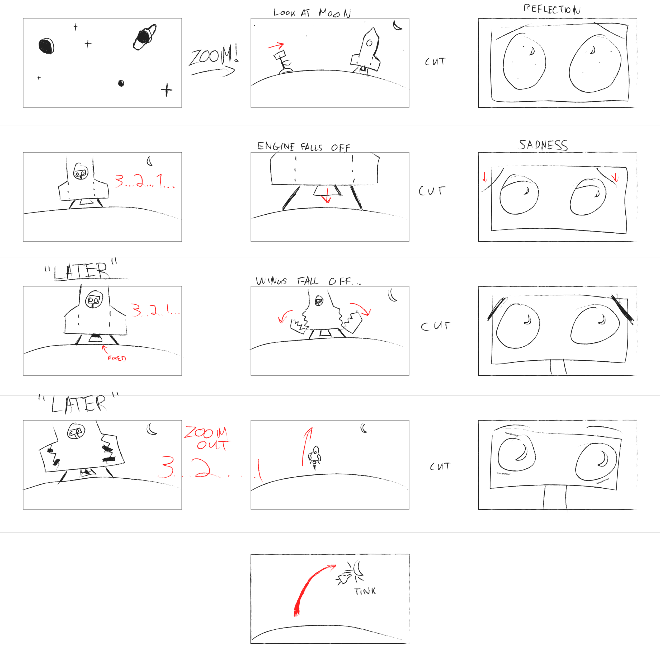
We discussed what we wanted the robot to look like and Fenfen also created a robot in Illustrator:
I created a spaceship in Illustrator, with the body, engine, flame, and wings in different layers. I split up each wing into two pieces with a rugged line each in its own layer and have patches on top.

In week 3 and 4 we learned how to import our assets to After Effects as footage and as composition so we can animate individual parts of the assets. Some useful tools I learned are the puppet pin tool to pin the joints of characters to move body parts like arms and legs, as well as following the animation parameters of another object using parent or pick whip. We also learned how to animate objects in 3D space, placing the camera, different types of lights, how to cast shadows and having multiple views from different directions or compositions to see reflected changes while animating. We also talked about how to slowly reveal an object using pen tool, have objects follow the path of a null object, adding a slider effect to a null object to link to different parameters, and adding expressions to parameters with hand-coded values.
My part of the animation was the spaceship launching and failing. During both launch attempts, I added a wiggle expression to the positions of all the spaceship parts, and created a null object with a slider effect, and pick whipped all the wiggle expressions to that slider to key frame the wiggle with slider so as to have all the spaceship layers wiggle for a few seconds. When the engine falls, I tried to simulate the motion of an object free falling and bounce back. I used the graph editor to animate the y position according to this graph to achieve a realistic falling and bouncing effect in the physical world. I also did something similar for the falling wings composition.
While James was working on the intro scene, I also learned that I can create a starry space background and bright glowing planets with a fractal noise effect.
After we put all the animations together, James added a background soundtrack that he composed that matches the pace of the story and we added some sound effects to make the whole animation come alive.
Here is the final render:
https://youtu.be/4mGDK5Js1sY
W9 Music Exhibition Design
Me, Adi and Camilla teamed up this week to build a virtual interactive museum exhibition explaining techno music. First, we analyzed some musical concepts defining the genre techno:
The central rhythmic component is most often in common time (4/4), where a single measure is divided into four beats marked by a bass drum on each quarter note pulse. Each beat can be further divided, with eighth notes dividing each quarter note in half and sixteenth notes dividing each quarter note into quarters. Famously called “four-on-the-floor,” the bass drum is the automated heartbeat or metronome around which all other sounds fall into place: a backbeat played by snare or clap on the second and fourth beats of the measure, and an open hi-hat sounding every second eighth note. The tempo tends to vary between approximately 120 to 150 beats per minute (bpm), depending on the style of techno. Techno focuses more on sophisticated rhythm and repetition (cross-rhythm, syncopation) than it does on melody or chord progression. The development is gradual where many sounds are layered and altered over time. All of these characteristics together create something automatically definable as techno.
Techno is a landscape. It’s a reaction and artistic statement about the actual automated world that we live in. It’s half machine & half human! Techno’s highly repetitive and mechanic rhythmic structure against human expressivity in sampling, modulating, remixing and looping shapes its unique art form.
From here, we identified three elements of modern techno music: 1. Repetition - “four on the floor” as the basic unit 2. Instruments being layered/omitted one by one over the course of a song 3. altering/modulating a sound texture gradually over time
With the elements in mind, we think the best way to explain how Techno music works is by deconstructing an existing techno song into individual instrument layers as the building blocks. We will have users rebuild their version of the track by adding and subtracting layers and playing with different combinations on top of the 4/4 rhythmic structure and give them expressive controls over multiple parameters that control certain layers.
Inspired by Valentina’s presentation with the different musicians for the fantasy Blues band, we came up with the idea to present different options for each of the elements, to give the user in our museum some feeling of agency of being able to choose their own sounds and controllers within the constraints of a techno infrastructure.
Our interface is inspired by the popular DAW Ableton Live's session view, but without the intimidating panels and knobs, reduced to the bare minimal core of triggering and stopping clips. Each instrument (in our case: a bass drum, multiple hi-hats, clicky percussion, rim, bass, brass hooks, pad drone, and a sequence) is a column of clips represented by blocks which are clickable for enabling and disabling. Since session view is non-linear, we decided to have a visual indicator to show where in the timeline the sound is out of 4/4 -- all following the bass drum as the heart of the song. Users will be able to modulate some parameters of certain instruments over time by dragging the sliders underneath the instrument columns. Some visual guide for the interface: https://www.are.na/adi-dahiya/techno-is-a-landscape
I started off by searching for stem files of existing techno tracks available for downloads so that I could have separate files for individual instruments. And I found Solace by Pan-Pot a good example of a techno song that can be used. So I opened up the files in Ableton and reduced each instrument track into its smallest unit and exported all the clips to be mapped into buttons on P5(sketch). I uploaded all the clips onto P5 and had all the percussive instruments looped every measure with Tone.Event. However I was having some trouble with instrument clips when looping them with Tone.Event, as since instrument clips are much longer 10-30m per loop. the clips don't start or stop until the current loop has ended, i.e. if a button is pressed at a random time, instead of loop starting/stopping at the following measure, it would start/stop until the beginning of next loop, which takes a long time. So I decided not to use Tone.Event, and just have the button control the start() and stop() or the Tone.Player, however, the clips would be out of sync with the percussive clips. I did some research and found that I can sync Tone.Player to TransportTime with sync(). The clips would still start/stop at an arbitrary time at mouseClick but I fixed it by adding the transport time of the next measure to start(), so that no matter when the user turns on the clips, they will still be in place with one another. Although I found the process of splitting Tone.Transport.position to get the measure and switching back and forth between a number and a string was a little tedious, I haven't figured out a better way to achieve enabling/disabling a long looping clip at the start of next measure.
Another big challenge for this project was to figure out the best modulating parameters for the instrument track. When listening to the original clip, it was very noticeable that certain parameters of the sound (high pass filter frequency? Resonance?) have been changed over time, when I tried to recreate that modulating effect using Tone, it was hard to pinpoint which effects were being used or which parameters were being altered. It seemed a little overwhelming because there are tons of parameters that I could experiment with and tons of variables, value ranges I could test with.
Ultimately, for a museum environment, we imagine that our installation could be shown as it is now, on a screen, for the user to play with using headphones or speakers with instructions popping up from time to time to prompt users to enable or modulate clips, similar to this Jazz Computer project. This is to suggest users what could be a proper progression of a techno song, but it's up to them to follow the instruction or not. Alternatively, it could be installed in a more immersive environment, such as in a room with surround sound, featuring tactile buttons that would trigger each sound with visual feedback on the walls around the user, which would line up with the instruments they have selected and where they are in the timeline.
Final project proposal 2
Idea: An interactive storytelling installation inspired by a scene from the movie 2001: A Space Odyssey, where the astronaut Dave shut down the AI HAL 9000 that controls the spacecraft. " In the film, HAL's central core is depicted as a crawlspace full of brightly lit computer modules mounted in arrays from which they can be inserted or removed." In the scene, Dave was removing the modules to terminate the HAL, as each module was being pulled out the AI started to deteriorate. Its voice was getting slower and deeper and it was begging Dave to stop as it was dying. And it finally sang a song "Daisy", which was the first ever song sung by a computer in human history.
Read MoreWeek 8 Pixelated Motion Detection camera
After watching the Brightness Mirror tutorial on processing pixels from video capture to lower resolution without RGB, only brightness values, I decided to modify this example into a pixelated motion detection camera, so that if there is any change in any pixel values, fill that particular pixel to red color. I approached this by adding a new variable pbright at the end of the nested for loop, hoping to save the brightness value of each pixel from the previous frame, and compare with the current frame. However, it turned out that my camera seemed to have turned the pixels with brightness values above a certain threshold into red, and filled the darker pixels with brightness values. Code: https://editor.p5js.org/ada10086/sketches/r1IiME9nm
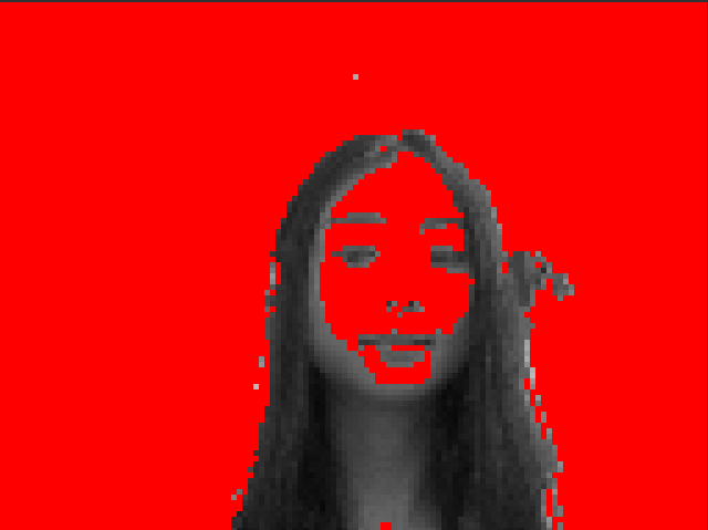
I had Dan look at my code and it seemed like inside the nested for loop, I was comparing the brightness value of the current pixel with the brightness value of the previous pixel in the pixel array instead of the same pixel of the previous frame.
Instead of comparing individual pixels, I had to save all the pixels from last frame as pFrame and compare the pixels in pFrame with pixels in the current frame to detect pixel change(motion). I referred to this MotionPixels code example (tutorial), and combined it with the brightness mirror code.
My biggest issue though was when I called video.pixel[], it wasn't returning anything. In console.log it was an undefined object. However if I changed it to just pixel[], it was doing what I wanted (accessing video pixels), but pixel[] was supposed to access canvas pixels instead of video pixels. video.pixels[] was working in the tutorial, but not working in my sketch, I was told it was a version issue. Therefore, inside index.html, I changed the library version back to 0.6.1 and it worked.
My final code: https://editor.p5js.org/ada10086/sketches/HJfXU_j37
Week 1 Stop Motion Animation - The Catch up
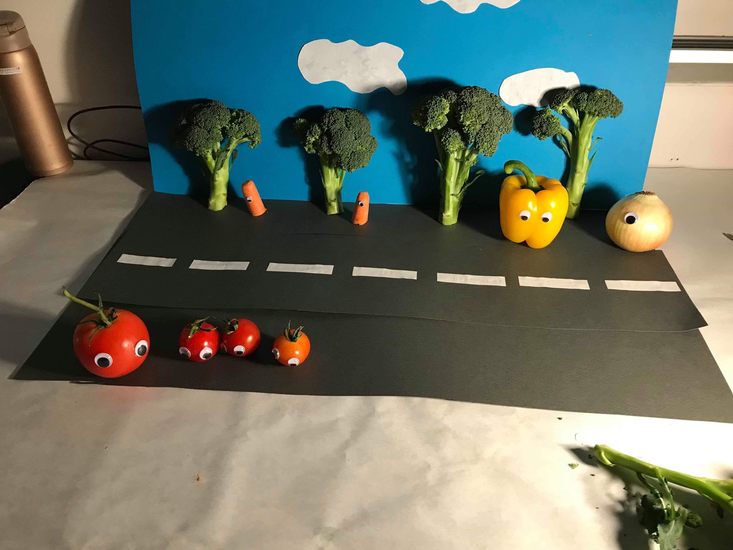
In week 1 class we talked about a brief history of sequential art and animation and some principles of animation. I loved how devices like Thaumatropes, Phenakistoscope, and Zoetrope generate moving images back in the days and create the illusion of characters coming to life. And those principles of animation were really helpful for me to understand how to animate characters and objects in a way that they look less mechanic and more lively based on real-world physical rules and achieve certain effects that can only be seen in animations through exaggeration. The prompt of this week's assignment is to tell a short story in 30 seconds or less with stop motion, which made me think about what kind of story can be told within 30 seconds of time. I instantly thought about jokes, especially really bad jokes that are easy to grasp. I had a whole database of bad fruits and vegetable jokes in my head I used to walk around and tell people, so I shared this tomato joke with my group, and we all loved it, so we decided to shoot a stop motion with real vegetables as the characters in the joke.
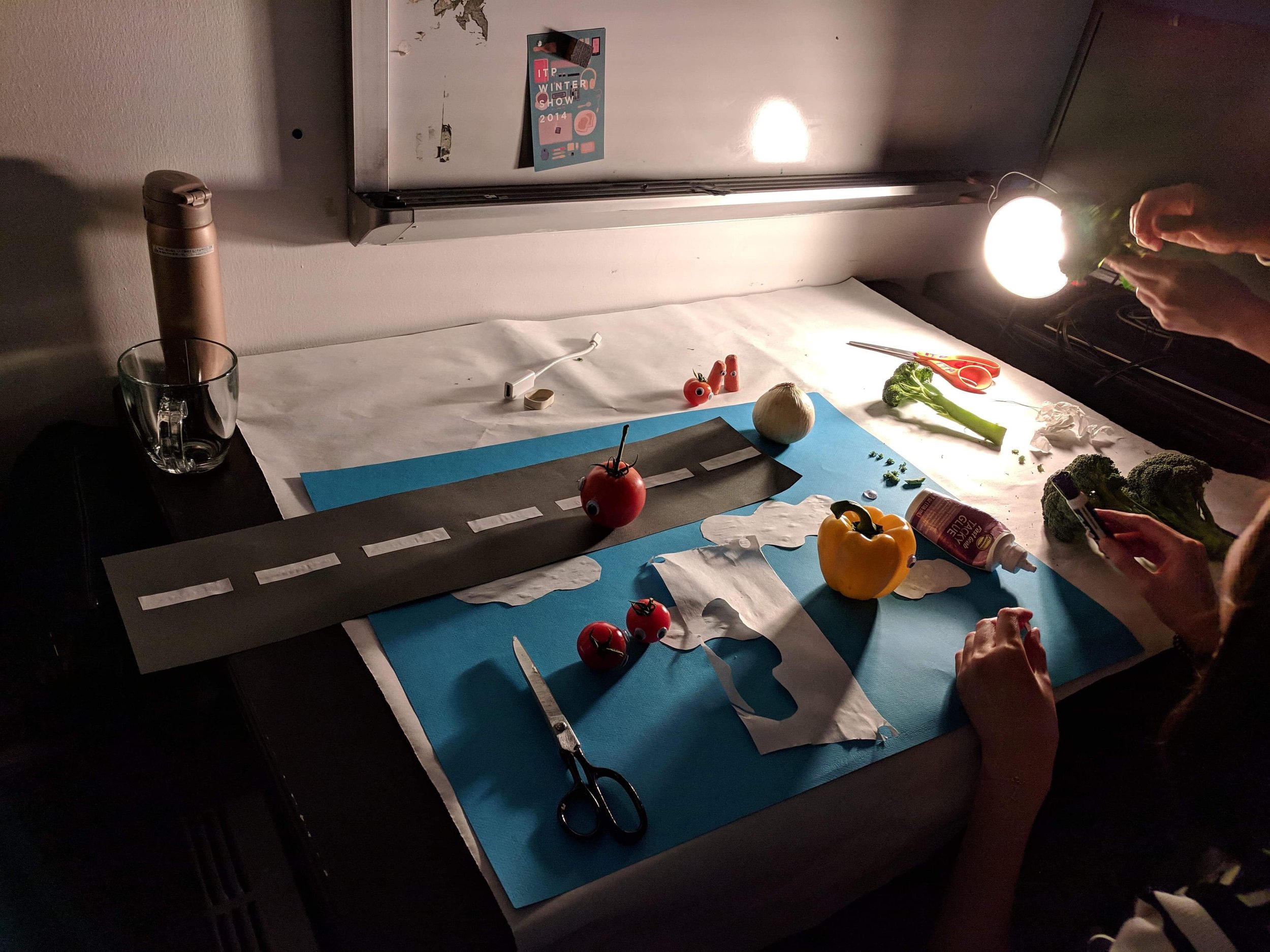
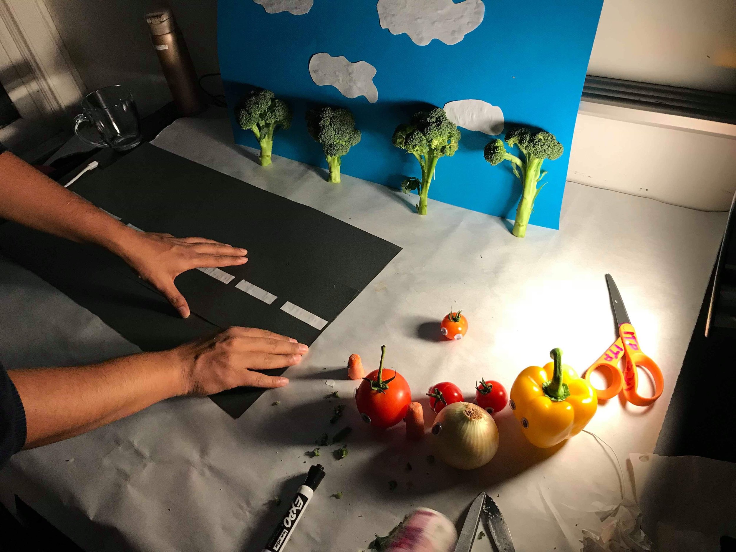
Before shooting, we collected all the materials: color paper for setting street and sky, a variety of vegetables, some plastic eye pieces to stick on the vegetables.
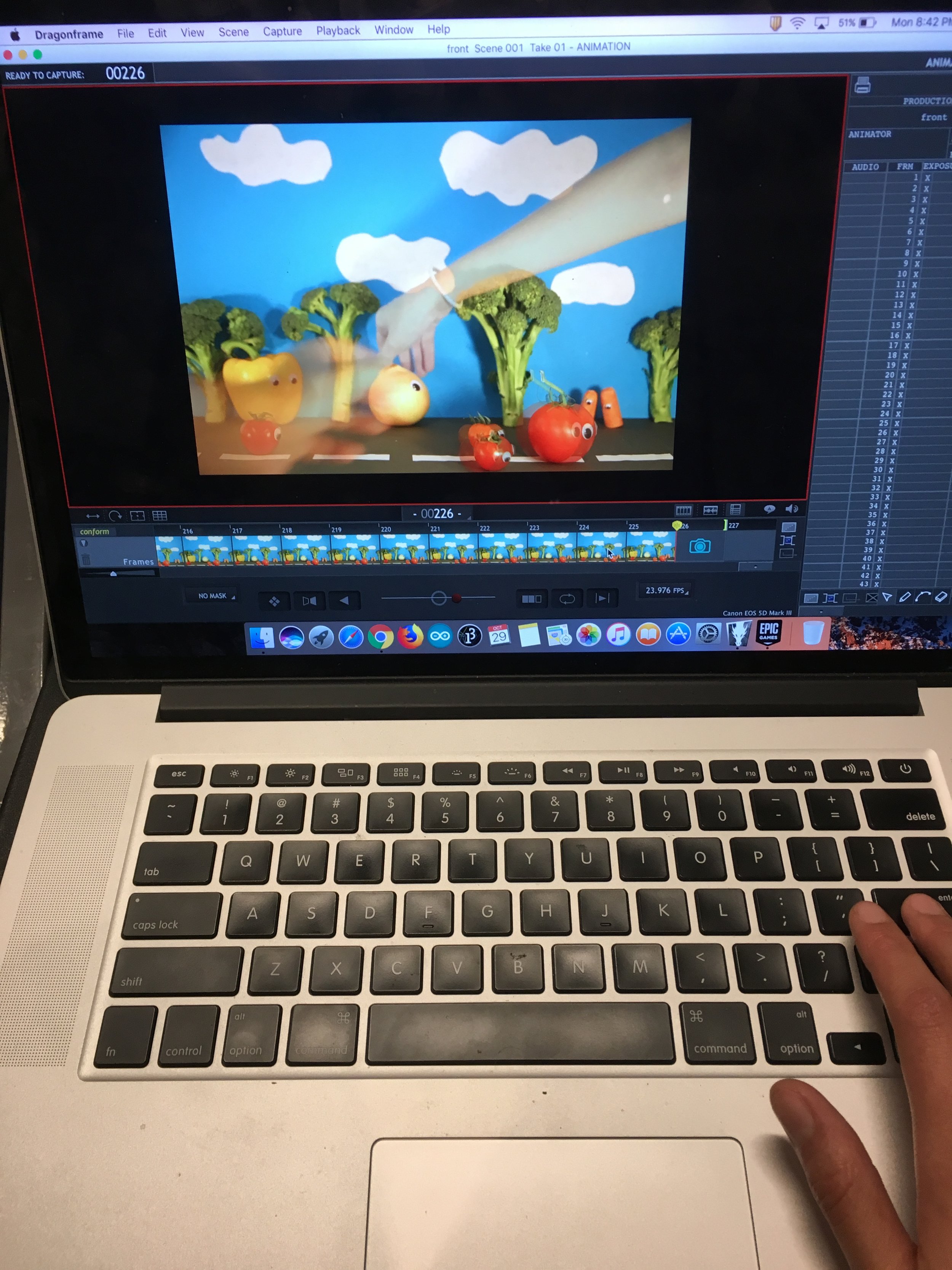
Following the demonstration of how to use Dragon frame and camera in class, we set up all the hardwares(1 Cannon 5D Mark III camera with tripod, 3 lights pointing at different directions), and softwares(1 production laptop with dragon frame).
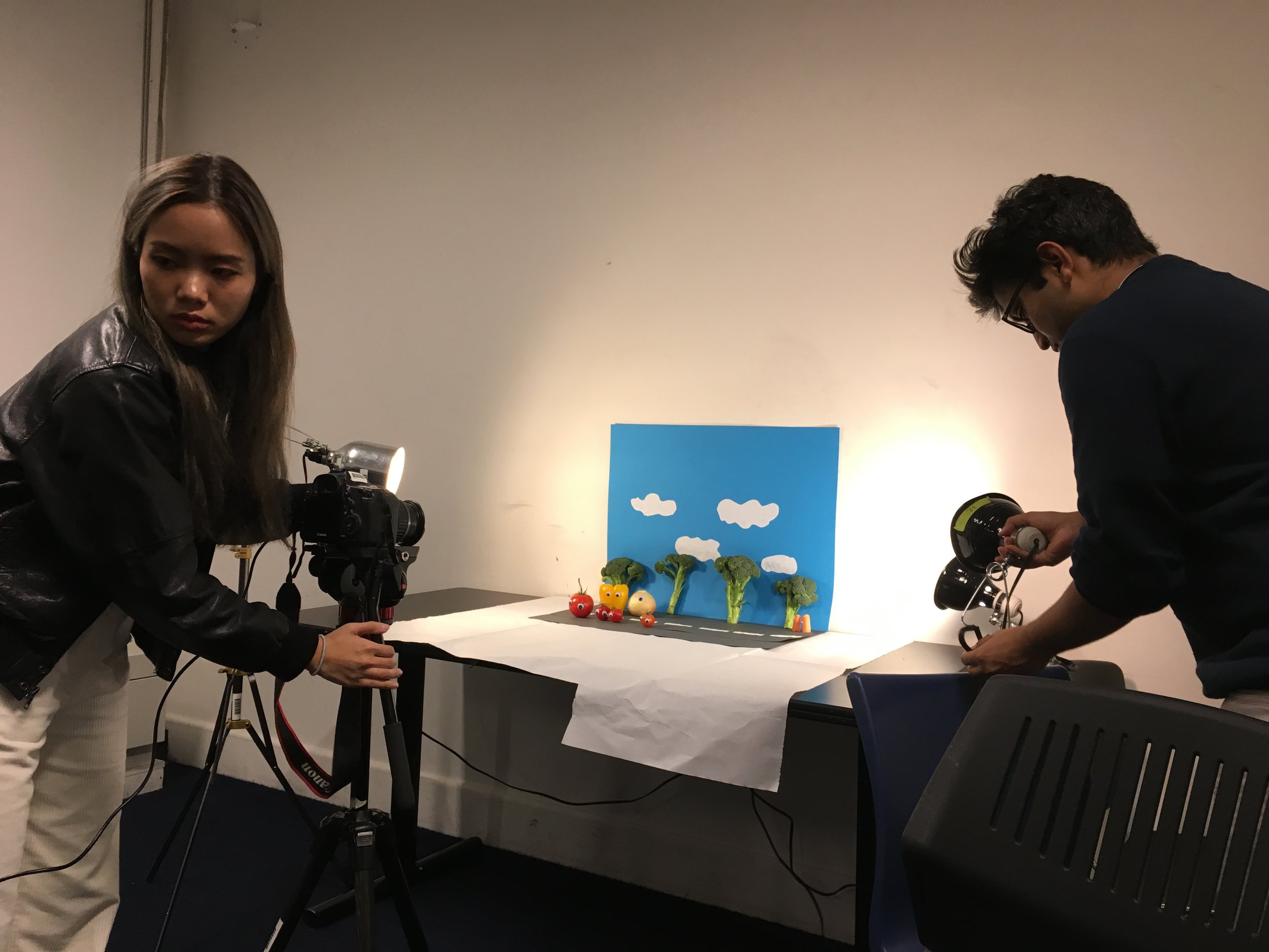
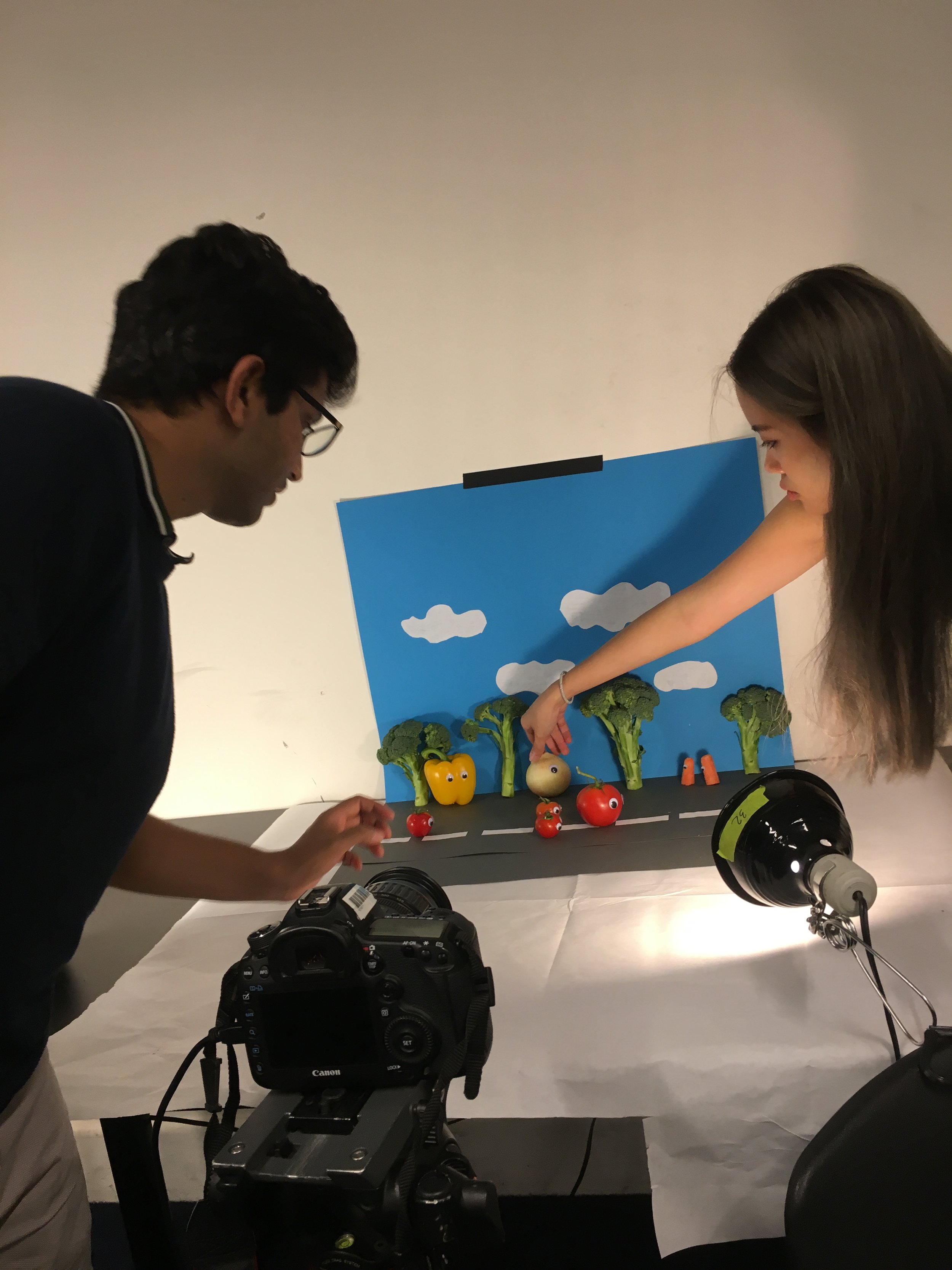
During shooting, we learned switching between the capture mode and video mode, doing focus check everytime we switch to a new shot. We chose large fine jpg files for our photos, took 2 pictures per frame, and exported the video in H.264 codec at frame rate of 23.97 and aspect ratio of 1620 × 1080. We edited the raw Dragon Frame export file in Premiere to adjust the duration of each shot and applied some background music to it. Finally we recorded our own voice for the characters and distorted it using the pitch shifter audio effect in Premiere.
One problem we encountered during shooting was that it was evening so there wasn't any natural light in the room so we had to borrow a lot of lights to project on our scene. We fixed one light on a tripod, and the other two were clipped on the chairs. We noticed that however we positioned the lights there were always some weird shadows being projected onto the sky backdrop, which is not supposed to happen in real life. So we were just holding the lights during shooting, which probably wasn't a good idea for stop motion because the shadows would just be moving around as the hands holding the lights are not stable during the shot. However, it turned out that the shadows just made it seem like there was some breeze and trees were moving along. Given the time constraint, we just settled with it. We were also having some trouble manually adjusting the white balance in the beginning, so the picture color came out a bit warmer than expected.
Our final video:
https://youtu.be/ne7z2TUaghY
Final project proposal 1
Concept option 1: As I just finished my Code of Music midterm project, a live audio-visual generator, I am thinking about keeping refining it, not just sound wise, but also interface wise. Because as I was playing with my own web-based instrument, I was pretty happy with the overall sound and visual reactivity and complexity, but I was still struggling with making my live composition more expressive. Having the whole interface living in the browser indicates certain limitations. I was only able to control the audio and visual with three sliders on the screen, a mouse drag function, and a key pressed function. I was having trouble controlling multiple parameters at the same time because there is only one mouse. So I thought about why not make it a physical interface, not necessarily physical buttons and sliders like a MIDI controller, which has already been made probably thousands of times in other ITP projects. I wanted to create something that make people "dance", either some sort of games similar to DDR with visuals indicating what actions users should take to match with the sound in order to get points, or playing with the idea of "body as cursor", to have different user actions as input for different parameters, so as to generate sound and manipulate visuals accordingly, to have human body act as an instrument.
Read More


